Captain’s Log – Blood Angels Hobby

GREETINGS, FELLOW GAMERS!
Captain Morgan here with a bit of hobby goodness for you today. Recently I painted up a substantial amount of Blood Angels for the Las Vegas Open (mostly for Horus Heresy) and several people have requested some photos and information regarding how I paint the red color for my Blood Angels, and what my list was for Horus Heresy 30k at LVO. I have a different article in mind for my 30k tactica (so stay tuned), so with that in mind here is a brief showcase of my Horus Heresy army, after which I’ll give you some tips on getting the same red as I did.
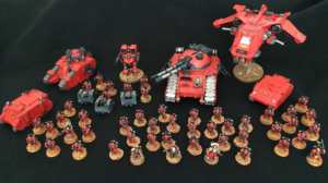
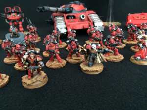
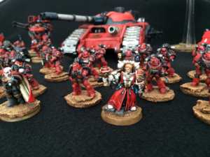
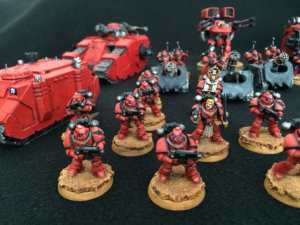
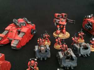
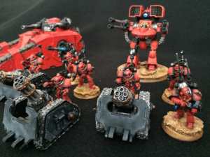
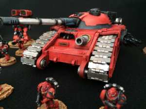
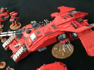
Aside from the two Rhino APC’s, the Fire Raptor, and the Sicaran battle tank, all of this army was painted in a brutal 4 week period. I am definitely what I call a “deadline painter” which is to say that I hobby the most earnestly while under pressure from a crushing, upcoming deadline. As a result, a lot of the “fancier” things (extra basing effects, decals, freehand, etc.) are missing from the army, but I am certainly pleased with how the army came together.

A RECIPE FOR RED
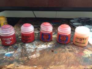
It’s taken me a long time to get a red that I liked well enough to stop experimenting (at least for now, right? Riiiiiight?). As of right now, I do everything with a brush by hand, as I intend to punish myself relentlessly until I get the space and inclination for an airbrush. Obviously, airbrush transitions will end up being a bit smoother, but the general principle is the same. I have two different techniques depending on if I’m doing infantry and small vehicles vs. large vehicles (which I use Mephiston Red spray on top of a black undercoat instead of basing it by ). Each will inevitably boil down to the use of the same 5 colors in order to get the red the way I like it: Khorne Red, Mephiston Red, Evil Sunz Scarlet, Wild Rider Red, and Kindleflame.
INFANTRY
For starters, I wouldn’t recommend doing more than 5-10 infantry per batch. In my rush to complete things, I did 20 per batch and ended up hating my life due to the repetitiveness of repeating the same thing over and over, again and again, and time after time. I may or may not have left some residual scarring in my speech patterns…patterns… patterns…
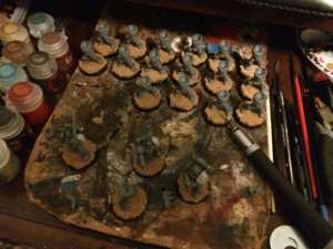
The first step is always in the basecoat. I have found that while a white primer will help make your colors brighter, I prefer the results I get from a black undercoat. The trick with white is that if your pigment is thin, the red ends up looking pinkish. Stylistically, that’s up to the person painting and there is no “wrong” answer if you like the way it looks, but building up the color from black creates the kind of contrast I like the best.
Next, get the first layer of red down: Khorne Red. Fully cover the armor plating you intent to color red with this. You’ll notice that the Khorne Red is especially dark on top of the black. This is a good thing, and I generally only do one coat of it, thinned slightly to avoid covering up the detail. That’s important when working with this many layers of paint, as glopping the paint on too thickly will obscure details. If there’s one thing my main man Duncan Rhodes taught me, it’s that it’s easier to put more paint on than it is to remove it.

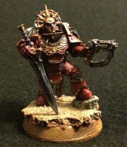
The rest of the colors boil down to doing the same task. Using each layer of red, respectively paint (or drybrush, if you’re lazy) smaller “circles” inside the plates of red, getting consecutively smaller with each brighter step. I tend to focus on bringing the lighter colors closer to the edges of armor plates, or to the apex of a curve (terminology?) that would reflect the light more. Save Kindleflame for the extreme highlights along the edge. By the time you’re done with the reds, it should look something like this:
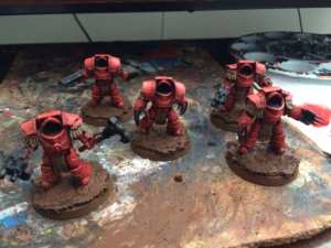
Finally, put a wash in the recesses of the armor joints and next to the darker accent colors to add that extra bit of contrast and depth. Any brown color ink will do, though I find the pigment of the Agrax Earthshade from the GW line works perfectly.
SECONDARY/ACCENT COLORS
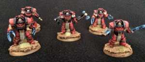
With the red out of the way, I wanted to take some time and talk about something that’ll bring out your red as much as the reds you use, and that’s your secondary (or supportive) colors. These are the colors that you use to break up the red and create some contrast on the model. The most obvious one that I use is blue for power weapons. From a color wheel perspective, green is the go-to complimentary color for red. I tend to not like green, as it has either a “Christmas” look (a bit cheery for the grimdark if you ask me) or a sickly look (a bit too nurgly for my loyalists). Gold looks great with red, and so does black (black looks good with everything, so don’t feel special). I also like to use an ivory leather look for cloth, robes, or tassles as it ties in well with the brown I use for basing. Your basing style in particular is a great way to decide which accents to use to tie it all together.
RED-DY TO PLAY
With that done, you should have a pretty good red to work with. For airbrush tutorials, there are several good ones online that you can look at. If you’re interested in seeing more hobby pics for this year, you can follow me on Twitter @sanguine_morgan and hit me up in the comments here or on the FB with any more hobby questions!
Cheers!
Captain Morgan




That’s a really good article. Thanks for that. Not only did you explain everything well, but it was an enjoyable read 🙂
I’m glad you enjoyed it. I’ll pass that along to Chris.
Thanks!
Your comment is much appreciated! It’s been a labor of love 🙂